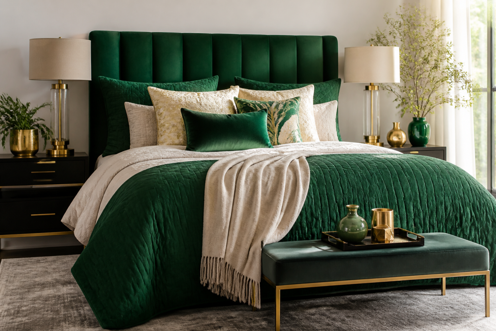
Few colors carry as much quiet authority as emerald green. Deep enough to feel enveloping, saturated enough to read as a deliberate design choice, and rooted in a natural world that our brains are wired to find restorative, it is one of the rare hues that can make a bedroom feel simultaneously opulent and calm. Yet emerald is also unforgiving: pair it with the wrong undertone, skip texture, or flood a small room with it, and the result can feel cold, dated, or strangely heavy.
This guide walks through the practical mechanics of styling a bed around emerald green — which shades to choose, which colors genuinely flatter it, how to layer texture so the bed reads as luxurious rather than flat, and which decor pieces earn their place. Along the way, we'll look at real color-trend data, design psychology research, and three worked case studies you can adapt to your own space.
Why Emerald Green Belongs in the Bedroom
Emerald green's reputation as a "serious" color is well earned. Pantone named Emerald (17-5641) its Color of the Year for 2013, describing it as "lively, radiant, lush" — a shade that enhances our sense of well-being by promoting balance and harmony. The color has stayed in the design conversation ever since, resurfacing in paint collections such as Sherwin-Williams' Evergreen Fog (its 2022 Color of the Year) and in the resurgence of jewel-toned interiors across hospitality design.
There is also a body of research suggesting green environments support recovery and calm. Roger Ulrich's landmark 1984 study found that hospital patients with a view of trees recovered faster and required less pain medication than those facing a brick wall. More recently, a 2015 study published in PNAS by Gregory Bratman and colleagues found that a 90-minute walk in a natural setting reduced rumination — repetitive negative thinking — compared with a walk in an urban environment. You cannot put a forest in a bedroom, but a deep green wall or headboard is a low-cost approximation, and it is why so many boutique hotels use emerald as their signature sleep color.
A widely cited survey commissioned by the hotel chain Travelodge reported that people sleeping in blue bedrooms rated their sleep quality highest, with green and yellow rooms also performing well and purple performing worst. The methodology is informal, but the direction of the finding matches what designers observe: cool, nature-derived palettes tend to feel more restful than high-energy warm ones.
Know Your Emerald: Undertones, Depth, and Finish
"Emerald" is not one color. It is a family, and the single biggest reason emerald bedrooms fail is a mismatch between undertone and the room's existing light. Before buying anything, hold a large sample (at least A4-sized, ideally a painted swatch board) against the wall and check it at 9 a.m., 2 p.m., and after dark with the lamps on.
Cool, Warm, and Neutral Emeralds
- Blue-based emeralds (think malachite, peacock, and teal-leaning greens) read crisp and modern. They flatter north-facing rooms with cool, indirect light and pair beautifully with silver, chrome, and icy whites.
- Yellow-based emeralds (forest, pine, and olive-leaning greens) feel warmer and more traditional. They are the better choice for south- and west-facing rooms that receive golden afternoon light, and they love brass, honey-toned wood, and cream.
- True or neutral emeralds sit in the middle — the classic jewel tone. They are the most versatile and the safest bet if you plan to change your decor over time.
Depth Matters More Than Hue
A common mistake is assuming that a darker emerald automatically equals more drama. In practice, a mid-depth emerald with a slight sheen (eggshell or satin) reflects more light and reads richer than a flat, near-black forest green. If your room gets fewer than four hours of direct daylight, choose a mid-tone emerald with a low-luster finish rather than the deepest shade on the paint chip. If the room is flooded with light, you can go as dark as you dare.
Color Pairings That Work With Emerald Green
Designers often use a rough proportion rule — the 60-30-10 split — where 60% of the room is a dominant neutral, 30% is a secondary color, and 10% is an accent. Emerald works best as either the 30% (a headboard, a duvet, a painted accent wall) or the 10% (pillows, throws, lamps). Making it the full 60% is possible, but it requires disciplined texture and lighting.
1. Emerald + Crisp White + Brass
This is the classic hotel-lobby formula, and it is hard to get wrong. White bedding keeps the scheme from feeling heavy, brass adds warmth and a little glamour, and emerald supplies the drama. Use a crisp white duvet, white or pale linen sheets, two emerald velvet shams, and a brass reading lamp or curtain rod. If you want a reference point, look at the Dorothy Draper-designed interiors at The Greenbrier in West Virginia, where saturated greens and white are used in confident, large-scale contrast.
2. Emerald + Charcoal or Soft Black
Moody and modern. A charcoal upholstered bed frame against emerald walls, with charcoal-grey linen bedding, creates a cocooning effect. Keep metals matte — blackened brass or gunmetal — and avoid pure black, which can flatten the green. This pairing works especially well in lofted or industrial spaces with high ceilings, where the extra visual weight anchors the room.
3. Emerald + Blush, Terracotta, or Warm Clay
Because emerald and warm terracotta are near-complements on the color wheel, this pairing has natural energy. A dusty blush or clay-toned quilted coverlet over emerald sheets feels unexpected and warm rather than saccharine. Keep the third color — the walls, the rug — firmly neutral (bone, oatmeal, greige) so the two saturated tones can speak.
4. Emerald + Camel, Ochre, and Walnut
An earthy, grown-up combination that suits traditional and mid-century rooms. Camel leather or wool, ochre accents in art or a cushion, and mid-tone walnut nightstands create a scheme that feels collected rather than coordinated. This is the safest pairing if you already own a lot of warm wood furniture.
5. Emerald + Sage and Cream (Tone-on-Tone)
For a softer, more contemporary result, layer greens of different values: an emerald velvet headboard against sage-green walls, with cream bedding and pale oak floors. This "green on green" approach adds depth without visual noise and is a smart option for small bedrooms, where one dominant color read makes the room feel larger rather than busier.
Colors to Use Sparingly
- Bright red: a true complementary pairing, but at full saturation it can read as Christmas. Use oxblood or rust instead.
- Purple: works only if the emerald is strongly blue-based; otherwise the two clash.
- Bright yellow: fine in small doses (a lamp base, a book spine), overwhelming as a bedding color.
- Multiple jewel tones at once: emerald plus sapphire plus ruby is a maximalist move that requires an experienced eye and a lot of neutral space to breathe.
Texture: The Real Secret to a Luxury Emerald Bed
Color gets the attention, but texture does the work. A bed dressed entirely in smooth cotton in a single emerald shade can look flat, almost like a swatch. The fix is contrast in three axes: sheen (matte vs. reflective), pile (smooth vs. napped), and weave (tight vs. loose).
- Velvet: the classic emerald pairing. Its pile catches light unevenly, which makes the color shift from near-black to vivid green across a headboard. Use it on the headboard or two accent cushions — not the whole bed, or it becomes heavy.
- Washed linen: the matte counterweight. Stonewashed linen in emerald or in a neutral cream provides a relaxed, slightly rumpled counterpoint to velvet's formality.
- Silk or sateen: high sheen, high drama. A single silk lumbar pillow is usually enough.
- Bouclé or shearling: adds softness and a contemporary edge. A bouclé bench at the foot of an emerald bed is a reliable styling move.
- Wool and cashmere: for throws and blankets, these add weight and a subtle fuzz that softens the color's intensity.
- Rattan, cane, and pale wood: natural textures keep emerald from feeling too formal, which is why they appear so often in modern-boho and coastal schemes.
- Brass, antiqued mirror, and smoked glass: reflective surfaces bounce light and keep a dark green scheme from closing in.
The Six-Layer Bedding Formula
If you want a bed that looks professionally styled, work in layers rather than buying a matching set. A reliable sequence:
- Layer 1 — Sheets: white or cream percale for crispness, or a tonal emerald for a fully saturated look. White is the safer choice and photographs better.
- Layer 2 — Duvet or coverlet: here is where emerald usually enters. A duvet in emerald linen, or a neutral duvet with an emerald coverlet folded at the foot.
- Layer 3 — Euro shams: two large squares behind the pillows, in a texture that differs from the duvet.
- Layer 4 — Standard pillows: two or four, in plain white or cream to break up the green.
- Layer 5 — Accent cushions: one pair in emerald velvet, one in a contrasting or neutral texture. Odd numbers read more relaxed.
- Layer 6 — Throw: folded across the foot or draped at an angle. This is your chance to introduce the third color in your 60-30-10 split.
Decor and Furniture That Complement Emerald Green
- Nightstands: warm walnut, black-stained wood, or a lacquered cream finish. Avoid bright white melamine, which can look stark against deep green.
- Lighting: brass or aged-bronze sconces, a ceramic table lamp in cream or clay, and warm bulbs (2,700K) rather than cool white. Warm light is what makes emerald look expensive rather than institutional.
- Art: botanical prints, abstract works with ochre or blush, and black-and-white photography all sit comfortably. Avoid art that is itself intensely green — it competes.
- Plants: a rubber plant, snake plant, or large monstera reinforces the biophilic effect, but choose plants with darker, glossier leaves so they read as texture rather than a clashing green.
- Rugs: an oatmeal wool, a vintage Persian with faded reds, or a jute weave. A rug in a matching emerald makes the floor disappear into the bed, which can feel flat.
- Curtains: floor-length in a neutral with a subtle emerald trim, or fully emerald if the walls are light.
Case Studies: Three Emerald Bedrooms That Work
Case Study 1: The Jewel-Box Guest Room (Small Space)
A 9 m² guest room with one north-facing window. The solution: a mid-tone, blue-based emerald on all four walls in an eggshell finish, a slim upholstered headboard in the same green velvet to extend the color upward, and everything else in white and pale oak. Two brass sconces replace bedside lamps, freeing both nightstands. The result is a room that reads larger, not smaller, because there is only one color story and no visual clutter.
Case Study 2: The Hotel-Style Master Suite
A large, light-filled master bedroom. The walls stay in warm greige; the drama comes from a king headboard in deep yellow-based emerald velvet, matching velvet shams, a white linen duvet, and a charcoal wool blanket folded at the foot. A pair of brass pendants hangs over walnut nightstands. This is the "30%" approach — emerald as the secondary color — and it is the most forgiving formula for anyone unsure about commitment.
Case Study 3: The Modern Boho Loft
An open-plan loft with high ceilings and industrial windows. Emerald appears only in accents: a linen duvet in muted emerald, a bouclé bench, and a vintage rug with faded green and terracotta. Cane and rattan furniture, terracotta pots, and a jute rug soften the space, while the emerald ties the otherwise neutral scheme together. The lesson here: in a large, textured space, emerald works best as a connector rather than a statement.
Common Mistakes to Avoid
- Buying emerald online without a physical sample. Screens shift green dramatically; always order a swatch or a sample pot first.
- Using cool white bulbs. They turn emerald grey and clinical. Stick to 2,700K.
- Matching every element. A fully matched emerald bedding set looks like a catalogue page, not a designed room.
- Ignoring the ceiling. In rooms with dark green walls, a white or off-white ceiling keeps the space from feeling capped.
- Forgetting the fifth wall. The floor matters — a dark green scheme over a dark floor needs a light rug to prevent a "hole" effect.
Seasonal and Practical Swaps
Emerald is unusually seasonally flexible, which is part of its value. In summer, swap the velvet shams for emerald linen, replace the wool throw with a cotton waffle blanket, and add white cotton sheets. In winter, bring back velvet, add a cashmere throw in camel or charcoal, and layer a quilted coverlet. Keeping the headboard and wall color constant while rotating the textiles means you get two distinct looks from one investment.
Key Takeaways
Emerald green is one of the most rewarding colors to style a bed around — but only when it is handled with intention. The shade you choose matters less than its undertone matching your room's light, and the color you pair it with matters less than the textures you layer around it. Use the 60-30-10 proportion rule, treat emerald as either a confident secondary color or a precise accent, and always include at least three contrasting textures on the bed itself.
- Choose a blue-based emerald for cool, north-facing rooms and a yellow-based emerald for warm, sunlit ones.
- Pair emerald most reliably with white and brass, charcoal, blush and terracotta, camel and walnut, or sage and cream.
- Layer velvet, linen, wool, bouclé, and a natural texture such as rattan or pale wood to keep the color from reading flat.
- Style the bed in six layers rather than buying a matching set, and keep at least one layer white or cream.
- Light the room warmly at 2,700K — it is the single cheapest upgrade to an emerald scheme.
- Test paint samples at three times of day before committing, and never trust a screen.
Get those fundamentals right and emerald green stops being a bold gamble and becomes what it has always been in the best interiors: a calm, grounded, quietly luxurious backdrop for sleep.